For the past several months I’ve come to appreciate how significant the choice of a typeface and specific color palette plays a role in my branding. As an aspiring Public Relations Specialist in the sports industry, choosing the right visual elements can create a strong foundation for my personal brand while building a strong, recognizable brand that’s crucial in the competitive field of sports marketing. Let’s dive into how Nimbus Sans Bold and Adobe Garamond Pro Regular, along with a thoughtfully chosen color palette, can effectively represent my personal brand identity.
The Power of Typography
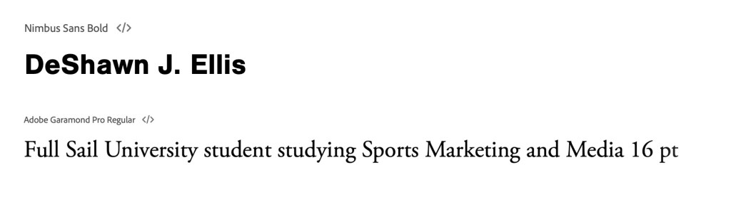
Headers: Nimbus Sans Bold
The choice of this font conveys t a contemporary and modern style that develops a sense of confidence for the target audience within the sports industry. This font not only quickly and clearly communicates with them, but guarantees the heading is visually appealing which is essential. Its robust dimensions emphasize important information making it easily recognizable. Whether it’s for a blog post title or a press release headline the message that can be effectively delivered to my audience ensuring that the impact resonates.
Body: Adobe Garamond Pro Regular
For a few specific reasons, I carefully chose this font to not only enhance but to unify the header and the body of a written passage. The serif font of Adobe Garamond Pro Regular provides a refined and readability that elevates the content. As the readers continue to browse through, they remain engaged with the material provided due to the sense of class. The sports industry’s dynamic nature is reflective in the balance modernity and tradition. By combining both the Nimbus Sans Bold and Adobe Garamond Pro Regular the readers will be able to seamlessly dive into lengthy content that can facilitate an easy-to-read passage.
The Significance of a Color Palette
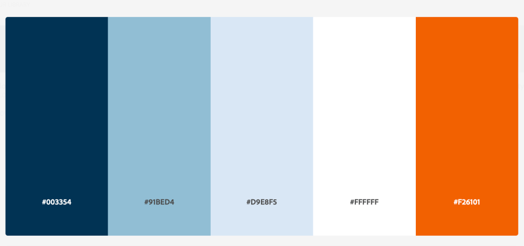
It’s crucial in shaping a specific narrative and personality when choosing a color palette for your brand. After carefully picking what would work best five colors exemplified what would resonate with my personal brand, the target audience, and the sports industry. The blues create a strong significance of trust, reliability, and professionalism, The color is often associated with various sports teams like the New England Patriots, the New York Knicks, the New York Giants, and various others. To add an appealing contrast to the darker tones, the selection of lighter and darker blues was carefully chosen along with the simplicity the color white provides. Lastly, much like the fans of the industry, choosing the vibrant orange adds energy and enthusiasm to the brand.
Bringing It All Together
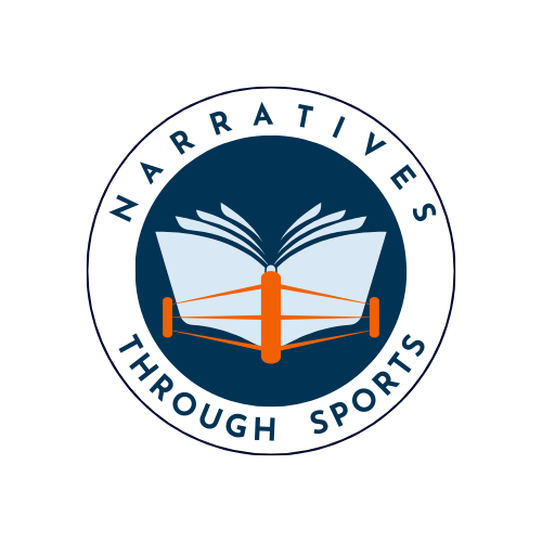
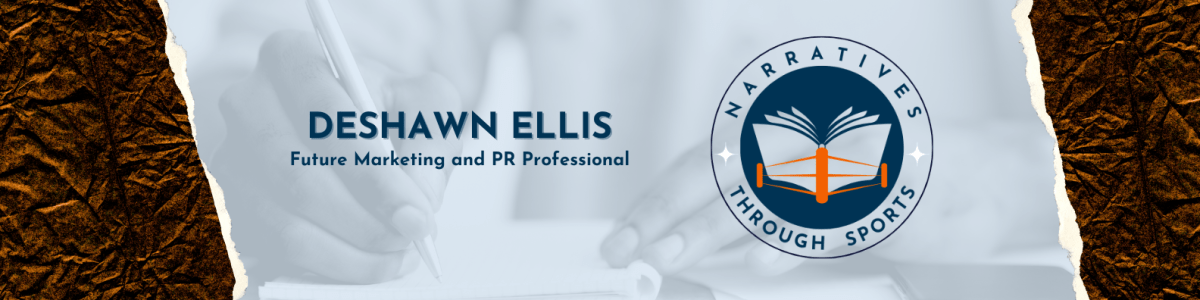
After every element I’ve chosen reflects my values and aspirations within the sports industry, I’ve combined all them to create a logo that ensures the content can continue to engage the audience. The design features a circular design with a central image of an open book and a ring post in orange. The surrounding text reads, “Narratives Through Sports.” The background is interchangeable between a light blue and a white. Both colors provide a sense of calmness and trust, with a dark blue conveying professionalism and stability. To stand out in this competitive industry, the logo is supposed to help establish a unique identity that can provide a compelling story through sports.
Establishing a strong personal brand is a way to strategically establish a successful career in the sports industry. It also helps individuals familiarize themselves with who they are and what they’re willing to provide. Each time these colors and sets of fonts appear together, it provides a sense of recognition for the brand. I am setting the stage for an impactful and memorable means of communication for the journey ahead. Stay tuned for more!
